Tips Help Better Infographic
In recent years, Infographic really become the focus of attention as a way to communicate complex ideas and information. We could not resist, when associated with an infographic, most of us have to see.
If you are interested in infographic design, let us explore are the following examples and discuss how to create compelling graphics and performance.
Create a focal point
Infographic often turn into graphics and text chaos. As a designer, it is easy to get a layout on both useful. One way to capture this trend is design central image is closely associated with the theme or message.
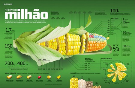
As you can see, corn is not only is only attractive image, it is present throughout space. It attracts attention and makes it easy to understand the relevant information. Once the graphics have to attract your attention, you can turn your attention to the surrounding information, graphics and text.
You can browse through?
Keep in mind that like any design, infographic needs a fundamental objective to complete. Typically, the tasks of an infographic is making complex information easier to understand through graphics. So your goal is to create something as easy to understand as possible.
Do not need all the details, but the overall data system should be easy to understand. If you do not maintain this objective, easy design mistakes. The result is a design with improved crude content, but the data presented do not really attractive and easy to understand.
I can not help but think that this infographic is not too difficult to arrange. As designed, you think of the number of scanning a data point.
In the example above, your eyes almost cursory everywhere to decipher the horizontal grid on the layout, the colors and the relationship between them. Simple but effective.
Using metaphors
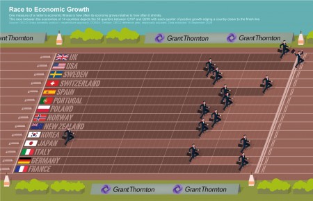
A the infographic sort of information in a boring way, complexity and following Infogtaphic is an excellent example of a metaphor that you can understand immediately.
The designer has been assigned the task of comparing the economic development among 14 countries. Too many old charts and information only for high school students boring. However with metaphors for each country, a primary school student can grasp the basic level.
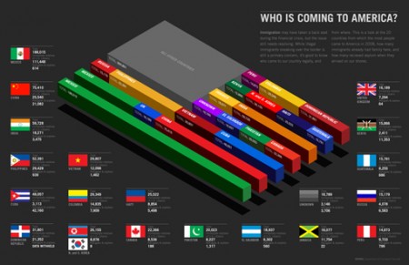
Another example below. Here, the flow of immigrants into the United States is characterized by a series of bar charts that make up the American flag. The data volume makes it easy to read and much more attractive.
View the original Picture
Create Slice
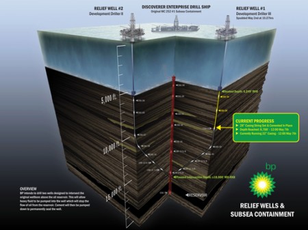
Sometimes infographic not just use the raw data, but also linked to the real world situation. In this situation, a common strategy is to use 3D graphics to illustrate like a sample similar to the real world, such as how it could be a scientific sampling.
As you can see, the result of this technique is illustrated particularly interesting and easy to understand. Will usually include a few paragraphs or even a few pages to explain a useful graphics.
View the original Picture
Data can look beautiful
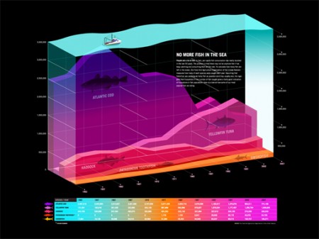
Sometimes infographic data processing only very few and put them together to read faster, sometimes a large volume of data. In this situation, the implementation is not simple, even if it is difficult to attract attention in an area.
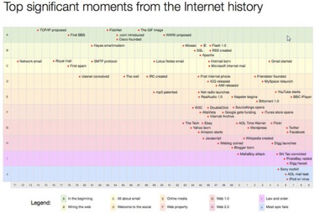
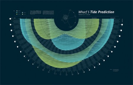
Instead, the big picture is key: We can understand when looking at the data at the same time? In this case, the designer is usually presented these data as a piece of art.
If you follow the link and look at this chart, you will see the information presented is very simple and easy to understand. However, the infographic is a great resource because it has turned rough information into something by a certain trend.
Bar Graph
He has taught me most of what I know has told me that: “Your first idea may be very general.” In the design, the idea first appeared in your head is almost identical to the designer, it is not always bad, but do not bring something unique.
In the infographic, the concept is often the Bar graph. Sure it is a really useful tool for presenting data visually, but from a design perspective, it’s a bit generic and lacking creativity. Next time you start to create a bar chart, consider creating unique.
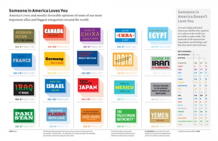
Infographic below is a perfect example. Here, the designers have used the 3D card stack to describe the opinion of the United States and its allies. More cards means more support. Just as a bar graph, but it becomes much more interesting.
View the original Picture
Use copy
Copy is one of the core design tools and should be used. This tool is especially useful and appropriate for the infographic as a number of data points is shown several times in different contexts.
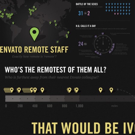
Here I zoomed Envato Remote Staff Infographic shows how the designer used copies as a Google Maps to represent staff. When the chart relating to the location, this is the perfect metaphor and the use of the copy helps us to understand immediately without deduction.
View the original Picture
Tell a visual story
This is a simple cocept behind the numbers. Infographic goal is to create easy-to-understand graphics, and you can design a visual story. Infographic will become more intuitive but do not use too much text. Users will want to read it and your image should come with the relevant information.
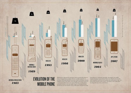
In the infographic below, I have received a large volume of information. Immediately, I know need to show the development of the mobile phone through the images. I see the photos on my mobile phone and the changes in weight and development of the device over the years.
Once you have designed infographic, try out all the text and some people have never seen before view of your design. We can show you what happened. What can you do to improve the transmission of information through these images?
Careful when using image comparison
This is a beautiful infographic design 101 design but is important that you need to think very carefully. Infographic important not only to represent the data, but also important when comparing data.
Typographic Arts is also popular but not really good transmission. For this reason, the designer used the chart, graph, illustration, or something that can deliver the necessary content.
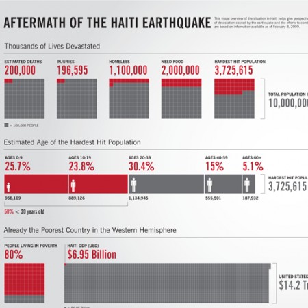
As I mentioned above, you should consider any bar graph that you use, here I extend this idea to present important data. Your job is someone that 14.2 trillion and 6.95 trillion, how to get there? Tools and tips that can help you in just a few seconds.
View the original Picture
Visual design
When you think of the use a former bar graph, it can be perfectly acceptable. But your next job can do to make it easier to read, even more so.
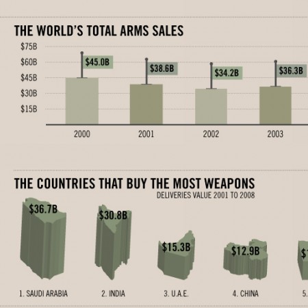
Note the use of the small flag on the following bar chart. Now, I can read the chart, I do not need the data the small flags. However, here is how to interpret the data in a visual way. May not need this information but the designer has added to the information easier to read and make sure.
View the original Picture
Some other infographic
Take a look at the link below if you want to see some excellent examples of infographic
Conclusion
You can see that a lot of the tips above are just the same: make the data become more user-friendly. As the designer, we prefer to refer to aspects of “beauty” in the relevant art and design, but the most essential is to make users happy.
Infogtraphics is one of the topics of graphic design that you will have to go through. We can get creative with fonts, colors, design, style and presentation information easier to understand than pure text.
Let us know your thoughts on the infographic above. Design What is your favorite and why?

