Understand Your Font
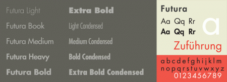
In this article we will take a deeper look at Futura, a font is not quite long legs, and especially it is formed by the basic geometry (geometric).
Impressed from the Bauhaus
According to the design principles of the Bauhaus, the German calligraphy Paul Renner began to create the first typeface Futura between the years 1924 & 1926.
Although not a member of the Bauhaus, he shared his views, and believed that a modern typeface should express in a more modern pattern of the previous shape.
Futura was sold in 1927, with the authorization by the font foundry Bauer.
When designing Futura, Renner avoided the use of the natural geometry, it should be done by the basic geometric rate, no legs, no frills. The result is a Futura sharp, simple, effective appearance to the present day.
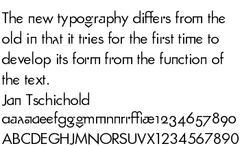
Renner’s initial design is the experience with a lot of words with alternate geometry and old-style figures (old-style), the number can be found in the typeface Architype Renner.
Futura’s success as a model for many fonts foot geometry (geometric sans-serif) was born, Kabel and Century Gothic, and many other typefaces.
Until now, 84 years since it was created, the word factory launched many Futura in digital format. Adobe is one of the largest companies.
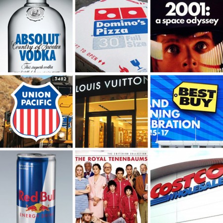
Many companies around the world also use Futura or variant version of it, can be told to Volkswagen and IKEA.
From the Moon to the big screen
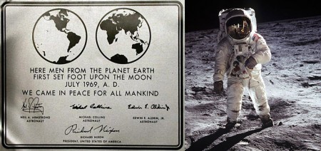
Futura has the honor of being the first word … the moon, it is used in medal of carrying astronauts of Apollo 11, in 1969.
Legendary film producer Stanley Kubrick uses Futura in many of his films, recently A Space Odyssey and Eyes Wide Shut (Eyes closed contingency
“It’s a Stanley’s favorite typeface. A type of sans-serifs. He liked Helvetica and Univers. Simple and elegant … I usually try to convince him to try a different style., But he forced himself to the type of sans-serifs
– Tony Frewin – colleagues with Stanley.
Recently Futura is also used in the Wes Anderson film The Royal Tenenbaums, The Life Aquatic .. The use of Futura (especially the Bold type) is very efficient in art projects, enroll and of course the movie.
Popular today
Futura (and variations) has become a hugely popular font in the logo, commercial products, film and advertising for many years.
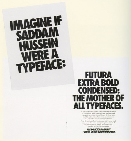
In fact, it is common to the point of direct art began to boycott the use of Futura Extra Bold Condensed too often – in TDC Typography 1992.
Futura Std Vietnamese keyboard available on vfont.vn

