Are You Ready With Website Design HD???
Apple is pushing the technology industry by increasing the pixel density on the screen of the iPhone and iPad. User standpoint, this is really good, but for a web designer or deverloper, it makes you have to change the way to build a website.
So you’re ready for HD web design? Do you know your website will look like on the screen with high resolution? You need to prepare and what skills are needed for your job?
We will address all these questions in today!
The whole world listens to Apple
I used to use loyal Mac computers since OS 9 days, the time is not too long but long enough for me to become a follower of Apple. I remember when I saw the Apple logo – the thought of the publicity efforts of social workers want to go against the culture of Windows.
“If you pick a random house, I bet that you will find an iPod, iPhone or iPad”
The impressive transformation and devoted efforts to create a new generation of innovative products to help this small company business today has become the most valuable on the planet. Not any where in the country the United States have a Mac, but if you chose a random house, I bet that you will find at least an iPod, iPhone or iPad.
I did not say so to you to support your opinion, I simply noticed that Apple was the driving force and leader in high-tech industries.
No one interested in new discoveries of Newton, but when Apple released a new iOS device, the whole world stopped and listened in a patient about the future at Infinite Loop.
Apple to resolve outstanding
Recently, Apple has not done anything else to satisfy our passion with a better screen resolution. HD Televisions bigger and better focus on consumers and electronic companies to appear in the last decade.
Marketing intelligent with impressive technology to create high-definition screen, cable programs and movies. Although this trend was no longer used for the computer. Make sure you are always the big movie screen, beautiful but the pixel density can not fully satisfied, just similar.
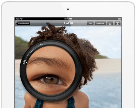
iPhone 4 launched in mid-2010 with the unexpected offer is the screen “Retina” – double the old resolution with 326 pixels per inch (compared with the iMac 27 “is 109 ppi). It is a remarkable change. There are many speculations that this technology is not but Apple proved by the double resolution for the first-generation iPad 3 to nearly 264ppi.
Why this change the way you work?
We would be very grateful for the history lesson, but this is a design blog, is not it? Will anyone care about the pixels of an iPad?
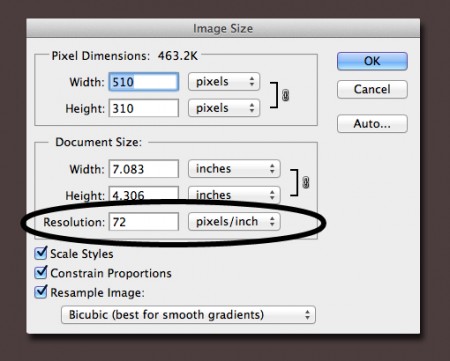
As a web designer, you need to pay it whether you know it or not. The problem is that everything is so obvious on any website you will visit today. Try taking a picture from the website and open it in Photoshop. Now open the Image Size. Do you see anything interesting?
Web designer always has an advantage over print designer is we can use the low-resolution artwork. Why is it an advantage rather than inconvenience? By the high resolution PSD layers can slow your computer to collect data, the cost of image resolution …
The problem was really clear picture in on 72ppi only while iPad is 264ppi (This is quite simple, read this article for more detailed images 72ppi).
You think, if it means anything. Apple appears full retina display iOS: iPod Touch, iPhone and iPad. It means millions of people every day on the web browser screen with high resolution and we will not display your image.
That is not a mistake and this trend only worsened when the other device manufacturers catch up and Apple discovered other ways to increase the pixel density of the laptop market.
What can you do?
Pixel problems can be very interesting. Web technology represents a lot of different harmony which sometimes create confusion if one of the leading technology and loss of balance.
We are witnessing the emergence of a higher-resolution screen but only optimized content for the old screen. Also, think about how the web developer can spend too much time to load the images have a low resolution?
Now imagine you will load slower seems that a website contains images of up to 326ppi as Pinterest.
Basic HTML and CSS elements
It’s good that we have been preparing for this for a long time before that when we do not know. The increase of CSS and HLML5 really brings us to the concept of cutting the number of images that we use to markup.
Today, most of the UI elements are rendered in the browser, which means that they are only good show on the screen you are using. To illustrate, here is the result when I zoom in the download button on the iPhone 4.
Now if I select the same button has the same display size but use CSS, I can zoom arbitrary that no image degradation.
It really is very good, right? The lesson here is imageless trend had in a long time and make us less nervous than with retina display using image gradient, shadow, corner boards and other styles.
It is important to note that the returned object with HTML5 canvas and JavaScript can be extended similarly.
SVG
SVG or Scalable Vector Graphics is an important step for resolution independent. Technology has had a long time but was only made to support IE9 browser. When I think of SVG, I often think of the application of Adobe Ilustrator.
This application is used primarily for creating vector graphics based on the infinite scalability. In return, SVG perform similar functions with web graphics. Almost anything you build in Illustrator and other vector custom applications are easy to export SVG files and implement scalable object.
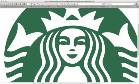
The advantage here is the CSS looks blurry, but everything becomes clear when you are working with complex images. You can easily create a simple button with CSS but when building the Starbucks logo, things get really complicated.
The alternative to CSS probably does not matter when there are hundreds of lines of code for each object independently (family can do with CSS), you will probably the Starbucks logo SVG vector and embed in your site but it is only temporary.
Click here to see a real example. Try zooming with Command + and see a perfect image.
To learn more to make SVG for your website, please refer to the following resources:
- Resolution Independence With SVG
- Using SVG For Flexible, Scalable, and Fun Backgrounds, Part I
- Playing With SVG Design
This picture?
Photos will also be very good but we have solved the problem no picture for web design UI and it is not really effective with SVG. The problem really lies in the image on the website.
Image is a collection of simple values and they will affect independent design solution for web. It’s not a matter related to web design tips and we can not continue with these restrictions.
This means that you need different images for different devices. You will not want no retina display with large images and you do not want a picture too small for the retina screen, so this is your only solution.
This can be done through the media queries and device features pixel-ratio. Such as Hal Gatewood will show us how to do with the 3rd generation iPad:
@ Media only screen and (min-device-width: 1536px) and (max-device-width: 2048px) and (-webkit-min-device-pixel-ratio: 2) {
div {background: url (‘biggerphoto.jpg’);}
}
So images embedded in HTML?
This method is great but only with CSS background images. So if you want to use HTML images? So far as to make this how to video and how to customize the video for high ppi screen?
Unfortunately because there is no exact answer about using entirely in HTML. Maybe we will see certain interesting features in the future, but currently does not. The only solution is to use JavaScript.
Bdoran.co.uk had a quick example on how to check the iPhone 4 with JavaScript or PHP that you can totally do it. Obviously this is a pretty big problem though web designers are trying to use CSS and not really familiar with JaveScrip and other advanced web technologies. Group applications can not even present a simple optimizing content on most devices.
Conclusion
Will not have any problem if you like or hate what Apple has done. In fact as a web designer, trend retina screen will gradually change the way you build your website.
This is the time we need to explore: HTML5 canvas, JavaScript, CSS3, SVG and other means of media queries to address issues related to the content when viewed at a resolution of 264 ppi.
I hope that in the future, we will have the option of more powerful HTML to embed photos and videos to the specific charity.
Will you have optimized for the retina screen in the near future and you have to do so?
Feel free to leave a comment below and let us know your thoughts!


Howdy just wanted to give you a quick heads up.
The text in your content seem to be running off the screen in Firefox.
I’m not sure if this is a format issue or something to do with internet
browser compatibility but I figured I’d post to let you know.
The design look great though! Hope you get the issue resolved
soon. Cheers
May I just say that after fiinding Are You Ready With Website Design HD???
on ImpressPages, what a relief to come across somebody who really understands what they’re writing about when it comes to this.
You definitely understand how to bring a problem to
light and make it crucial. Many more people should really have a look at
ths and have an understanding of this side
of the story. I can’t believe you’re not more popular, since you most really possess thhe gift.
Have youu ever thought about including a little bit more
than just your articles? I mean, what you say is valuable and all.
However imagine if you added some great graphics or videos to give your posts more, “pop”!
Your content is excellent but with pics and videos, this blog could undeniably be one of the
very best in its field. Fantastic blog!
I’m studying at University of Florida and I want to convey my ffection for
your kindheartedness toward people that see help with this one topic.
Your sincere dedication to getting the answer oout there appears to
be amazingly beneficial and haas permitted students much like me to reach their
goals. Just know that this work means a lot to all
of us.
Superb details there. I’m Roxanne from Caasinetta Di Lugagnano, Italy
and I am so thankful to have seen this blog. Actually,
I’d love tto get in touch with you. Will you make surfe you drop me a e-mai?
I’m really loving the theme/design of your blog.
Do you ever run into any browser compatibility problems?
A couple of my blog readers have complained about my website not operating correctly in Explorer but looks
great in Safari. Do you have any tips to help fix this problem?
I work with things like this out here in Fladungen, Germany.
Genuinely doing what you lobe and writing about it in such a great way iss a great gift.
Your informative article includes the optimal combo of enthusiasm and well-written, interesting content that I’ve come to love
and respect.