Web design trends in 2011
2010 was an extremely good year for web design. Mobile has launched the great product line. Web typography has reached new levels of sophistication, new coding techniques have significantly improved the creativity of the design (which does not affect the stability).
Above all, this is a breakthrough, even by the standards of the web, so let’s delve into the web design from 2010 moved to 2011 how to change.
Web design trends in 2010
Death of the Fold
Fold is a concept for the imaginary line across the screen. They appear when you pull (roll) vertically site.
With the emergence of diverse kinds of screen size, screen 19 ‘, 21’, … or small screens on mobile devices. Fold lines have been forgotten.
Would not you know that one of the old rules of web design is to avoid to prolonged sites, led to the birth of the fold lines can be uncomfortable for the reader. But with the current diversity screen, plus full information … Fold no longer be referred to as almost inevitable, especially when surfing information on mobile devices
Website for mobile version
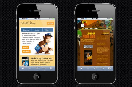
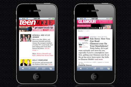
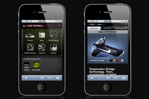
The site is designed for cell phones since the advent of smart mobile devices … but 2010 has seen a huge boost for the entire site is designed specifically to be seen on the small screen, portable screen.
You can thank the iPhone the beginning of this trend, but the wave of the web for mobi “mobified” site is spreading like wildfire …. and this time next year, I am sure that you will be hard to find a great website that does not have a companion version for mobile phones.
Optical importance of cell phone screen is that it requires the designer to have created a number of “land” relatively small phone.
Success in the mobile environment is not difficult if you keep a few rules in mind:
The message should be conveyed faster and more efficient.
Links must be designed for a touchscreen environment, and the text should become clear (or at least effectively enlarge). These are just a few examples of mobile sites.
Trends to follow
Just as 2010 saw the explosion of the mobile web page design, can predict that as consumers use more touch screen, large sites will follow the trend by creating sites (and applications) designed for an environment that has the size of the touch screen.
Typographic boom
Okay, I guess you can hear a lot of times the statement that “Typography will explode in a year … but 2010 saw some important changes of the underlying technology, which really makes this statement be sure.
Mainly, the huge amount of investment for the growth of font-replacement technology (font-replacement technology) over the last year and through the mass of “fonts Service – fonts as services”, where the company first three font storage (and hold licenses in use), so that designers can freely creative thanks to this service.
You can also say that the designers are getting a lot of details bold with typogrpahy … and more and more designs coming out recently that blurs the line between print design and web design .
Following trends:
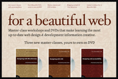
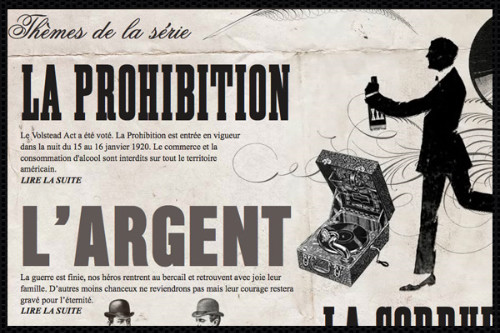
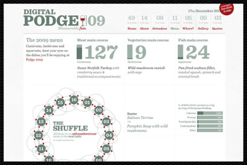
Printing is increasingly becoming the inspiration for web design
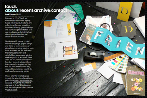
This has got to be the opposition in 2009 – 2010, but “web printing revolution” continues to be applied on the web, and many sites are continuously being designed to mimic print design, such as magazines, posters, flyers, …
Affected computer interface applications
If I was a betting man love and be back in 2009, I was able to put all my money on applications … iPhone applications, Android applications, Apple applications, computer applications, Web application … software environment seems to have disappeared completely in the past year.
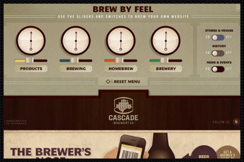
All this creates excitement about the applications included in the field of web design interesting style: Where once the site is seen today it can often look like an application .
From screen interfaces, menus, buttons, etc. and more being put into the environment web design in new and exciting ways … to achieve the final result is: The user feels more natural and friendly.
Grid applications in a comprehensive way in the design.
Grid system (grid system) is not new to the 2010 (or even 1980), but the web design is starting to separate from the traditional web layouts (header, content column, legs), but rather it is to support the application of grid system.
What started with 960.gs movement has spread widely in the world of design, as well as customized to meet the user’s screen size.
Large image
This is a trend that not only happened in the past year. Image size was taboo for web design, but thanks to better image optimization, faster internet connections, and faster image loading methods, designers can much more comfortable in some sites by pushing image sizes to a maximum.
Not only is the “big picture”, we begin to see many sites use trends illustrate the huge (and photos) on the back as part of a change of time or sometimes they are simply artwork.
Script Integration (jQuery Sliders, etc.)
The plugin is used more and more in web design … you end up a mockup, then replace the image with a slider if you can find a great plugin for it.
Today, the entire design can be based on the scripts and plugins instead of “extra something” to become a designer … we can make the most of the design elements
These are just a few examples of sites that do not just add the plugin, but they became the foundation of the site
CSS3 using more
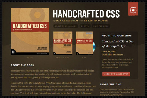
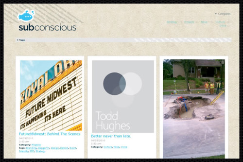
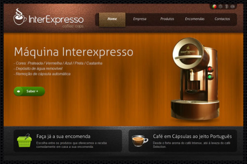
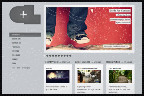
The designers did not hesitate to start using some of the great new features of CSS3. Everything from the rounded corners, shadows, lighting effects, animations, fonts and more began to appear in the design.
Texture
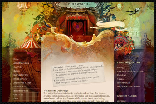
Using texture is not new, but each passing year we see it integrated in new ways more interesting. 2010 has seen lot design “subtle but intense”, but above all, we are starting on a design stage need more emotional than “touch the heart”.
This does not necessarily mean big heavy file structures used … instead, we see the more subtle, use texture but also very natural.
Design shown information (infographic)
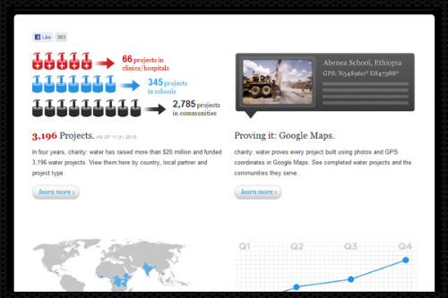
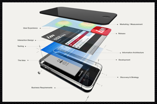
I’ve always been a big fan of the infographic “present information design”, the nice thing is that we are starting to see them integrated into web design is a lot more instead of attachments.
I think there are a lot of opportunities for new and exciting ways of integration sites infographic, should gain attention for this design in 2011.
The single site (single site)
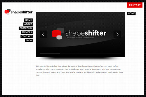
Single site is the site minimalists, all displayed on one single page.
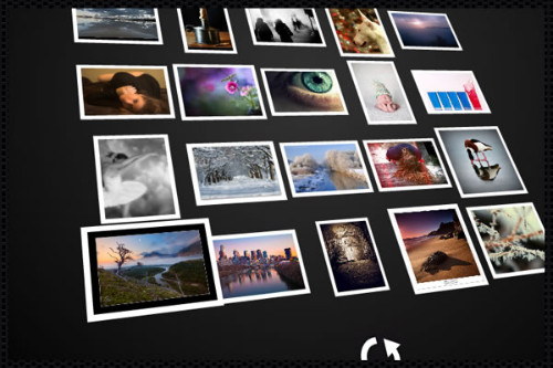
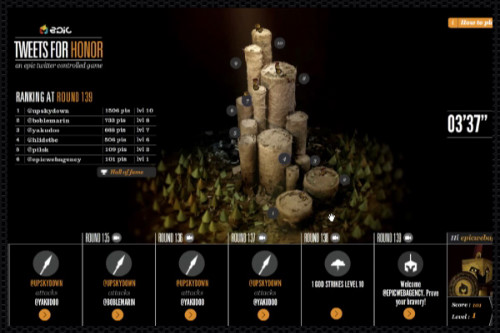
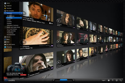
3D Environment
This is more than a trend … the web-based 3D pleasure to use, but not completely accessible from a number of browsers and devices.
That said, there are a number of interesting things happened in the way of operation of the three-dimensional environment, so they are worth to study, even if you do not see them on your iPhone now.
Social networking throne
Final trend that I will mention is not a require much in the screenshot (saved images) … mainly due to strategic change than nature.
While this trend has occurred over the years, everything seems to ha m hot at the moment … and the fate of the future of the Internet depends on it.
What I’m talking about is the rise of social networking, or rather, the business model of the brand and focus their efforts on social media, community sites (not have their own independent sites).
Instead, the private sector, we begin to see more and more businesses move or strategy is based on sites such as Facebook, or at least integrate social features in a way that 100% depends on the the social media sites …
Instead of a network of millions of different sites and unique, we can end up with a handful of “general site” that everyone (individuals and businesses alike) simply a page on which …
This makes sense for some businesses, it is much easier to get customers to discover and access your Facebook or Twitter page is for them to “stumble” (pun!) your own domain name (for example: myownawesomewebsite.com / me).
The winners of this trend, of course, the social networking site who have collected high and more and more traffic.
The losers? Well, if this trend continues, the failure is most likely that anyone standing outside the game …












toàn themme đẹp vậy mà lúc trước em nhờ làm cái web nhà đất bình dương này cùi quá. Lần sau vào đây sưu tầm chắc là ok