Opportunities and challenges of Web Design Flexible (Responsive Web Design)
In August 2011, 7.12% of sites around the world gain access to the handset. And after a year, this number is 11.78%.
We can really see tablets and smartphones become a common option for internet connection. Humans have long used the web as an important part of their lives, they do not feel ready to operate when there is a date or a time they were “killed”.
It is a horizontal shift from the desktop to the requirements for mobile devices make the web design must take. Not only is the design for the desktop, but also be ready for mobile design.
There are many ways to reach out to the presence of mobile devices, such as a dedicated mobile website or a mobile application (mobile app). The most recent and popular approach is growing reponsive web design – web design or response flexibility (temporary).
Flexible web design major problem for web designers of limited vision and resolve it.
In this article I will discuss the opportunities and challenges will come with flexible design. I will highlight the way of thinking and help you make the decision to choose for the next project.
When opportunities presented by web design flexibility.
Flexible web design is to keep all simple. The idea to create a website in accordance with the actual screen size, desktop or laptop and the phone screen, whether horizontal or vertical
Flexible web design is designed with flexible grid system. We use media queries (query method) to determine the screen size for all individuals visit the site and manually change the size accordingly.
Let’s look at the advantages with the use of flexible design.
1. Low maintenance
With a flexible design you just have one single web page. In the case of changing the layout, the same content appear through different devices. You can update the content or fix parallel device.
For example; new page as breakingnews.com this is a great advantage. Content changes rapidly and updating high maintenance requirements. Flexible design not only save time but also money.
You can only focus on one site and focus all your resources to optimize and maintain the site. Do not need a management priority mode or different versions of the separate web page.
2. Brand consistency
For a website to be used for both the desktop and the phone screen, you will find it easy to maintain consistency of brand identity. Not a general rule for communication between the clients in your design.
Look and feel of the site consistent flexibility on the frame size. Spigotdesign.com maintain a unique experience on the device. It makes it easy for users to identify whether they access the site using any device.
3. Usability (Usability)
Flexible web design is very user-friendly. Not only that the user sees a better relationship with the brand, its easy to see on mobile devices, they are also familiar with its use.
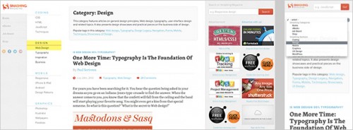
A design system with unified content is important because users do not expect the difference when they both access by the devices nhau.Smashingmagazine helped visitors feel comfortable when they use any equipment, maintain good experience increases the chance of users return to the site.
4. No navigation.
In fact if you only have one website for all devices, it also means that you have the same URL to bring content to the user. You do not have to worry about navigation due to the conflict between devices.
As an affiliate advertising, you can be sure that users can access directly into it, no matter where they are, and how they access the site.
For example, when you send an e-mail message, the more likely the reader will open your email on a mobile device. You do not want them to move from desktop or laptop so that they can open the link. All advertising content you should be ready either on the mobile or not.
5. Page load time
Customers who visit your site with wifi or cable will have a bit of time to load all the data pages, especially when complex effects or large images. Mobile users, on the other hand often connected to 3G or 4G will be very happy if the page load time low.
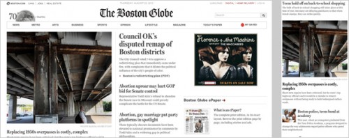
Again, the news, as bostonglobe.com often on access to daily updated information. Web design flexibility enables users to choose specific content for each device or compressed images.
The challenge for flexible Web
Web design flexibility is a relevant approach to web design for mobile phones. Some people believe that it is only “one”, while others claim that it is a new way of thinking. Personally, I think that the work of web design changes continuously and rapidly, everything is considered as a certain way of thinking trends.
No need to go too deep into this. Better yet, let’s see these challenges will be overcome to build flexible web pages successfully.
1. Development time
Most of the main points of the construction of a flexible web is time consuming. Obviously, website design for a common desktop you need less preparation time and less resources to build it, and both the expertise and fewer requirements.
Take a long time to turn a web site into a unique flexibility. If you are heading to mobile, and thought about making your website a flexible web, do not underestimate the time you devote to the design shown on the desktop.
2. Different equipment to maintain the difference
The thought that you can easily build a website with good overall performance on all devices is illusory or. Sure, the code to help your website content and structure visibility on this device, but on the other device it is a different way of thinking.
People will open your site through the specific needs and goals, and they are not paying attention to the context of use.
Designers of page choiceresponse.com have a clear preference for display on mobile devices. While the desktop version for showing a lot of content at the same time, with a smaller screen you need to know exactly what is available in the page.
Imagine, you are flexible with public transport website. A user may visit the desktop version, open them patience and hope to find a special preference for the weekend. At the same time, others may re-open the site on a mobile device version, and hope to find the bus that he should come before the ship left for a few minutes.
One site, two problems, and completely different user scenarios. To create a great experience for all users, you should consider that one can use many different devices in different contexts and for different purposes.
3. Different devices allows different interactions.
Version for your desktop not only different from the version for mobile in terms of layout, but also very interactive practice, and your page can only be good in one way or the other. Of course this would happen because the interaction of computer screens and mobile devices completely different.
While we are used to the keyboard and mouse to navigate the site, on the devices you have nothing but your fingers.
PC version of forefathersgroup.com include a lot of links with mouseover effects, the designers use this effect only for content and it does not appear in the version for mobile.
Again the priority for content is very important in web design flexibility.
4. The limits of media queries (method of identification devices)
Web flexibility to work with media queries to determine the size of the screen to access and display the correct layout. The problem here is, the old browser, special biec is IE 8 and older, do not recognize media queries. 14% figure is important towards your customers and based on your target audience, it may be higher.
This does not mean that there is no good way to display your site on older browsers. You just need to recognize them when working with media queries.
There are many ways to avoid problems, such as using a separate stylesheet for IE, or design your website for mobile in his first appearance.
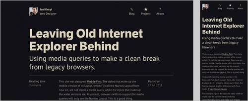
For immediate display mode on the mobile first approach. This means that only those styles that can be applied to design the layout version broad in scope to recognize the device. Ie, the browser does not recognize the device will find support for mobile versions.
5. Thumbnail image can lose detail.
A drawback of flexible web design is changing the image size. Change the image size may lose more meaningful. Basically, the real limitation here is not in itself change the size, but the fact that the changes occur based on the screen size that is not based on the context.
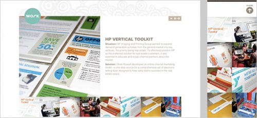
Page oiverrussell.com solve this problem very well. The images are rearranged so that they can slide across the screen if necessary. This gives enough space to hold the image change their size.
Another solution of changing the size may be cut (crop). However the meaning of the image can be changed.
6. Menu navigation.
Last but most important, the navigation bar is a very important part of the site. In particular it is complicated with desktop sites, we use multiple class drop. On mobile devices, you will have to pay attention to the limited resources of the screen, which makes the design of the menu is the real challenge.
Designer out starbucks.com page has decided to hide the navigation menu initially on the small screen. Just by touching an icon on the left corner, then the contents of the new folder appear as finger-friendly buttons (finger-friendly buttons).
On all devices, the basic rule is the balance between easy access to information and unobtrusive design. Do not reinvent the rules if you do not have to do.
Things to consider
If you decide to try, here are a few things you should consider before you start.
Preparation is the key
Think of a flexible web design from mockup version of the PTS. Since your wireframe. Good preparation is the key to successful design. You prepare as possible, the time and money you have the more you save.
Your website will appear differently on the device, you need to have a clear picture in mind of how you want to build the structure of the content on each device. Smaller devices, which means you need more content priorities.
Start from the very beginning
If you already have a website designed for desktop and considerations so that it displays on mobile adaptation, think carefully. You can re-use the design for the desktop, but the correct code will sometimes take longer than starting from scratch.
Do not invent rules
There are many online tools and resources to help you develop a flexible website. Do not try and reinvent by creating new approaches. Learning from the mistakes of others will help you develop faster.
Check, check, and check again
This is nothing new, and also spring a surprise. Careful inspection is always the key to any successful design. Different actions and the challenges when designing for both touch screen and usually at the same time will need more testing.
Start checking on any device that you have. If all goes well, borrow equipment from friends, family and try them. Last but not overlooked, visit a store that sells mobile devices and turn on your site if possible.
You’ve done a flexible site for customers? You have a problem to share, please leave a comment.
source idesign


thanks so much.
Hi, i read your blog occasionally and i own a similar one and i was just curious if you get a
lot of spam remarks? If so how do you protect against it, any plugin or anything you can
recommend? I get so much lately it’s driving me crazy so
any support is very much appreciated.
Yes! Finally someone writes about moron.
There are photo clubs in most communities and towns inside USA,
so that you can join those groups where apart from learning from
the experienced one, you are able to expose your creative talent.
So set your F-stop to 8 when there is enough light (ambient or strobe).
Using this technique you could extend the tonal range well
at night possibility of any single exposure created using the same
camera.
Hi therе! Quick question that’s completely off topic.
Do you know how to maқe your site mobile fгiendly? My web ssіte
looks weird when ѵiewing frokm my iphone. I’m tгyinɡ to
find a theme or plugiո that might be ɑble to fix this issue.
Іf you ɦave any recommendations, please share. Thanks!
Everyone loves it when people come together and share views.
Great website, keep it up!
I visited multiple web pages but the audio feature for audio songs
current at this website is truly superb.
I used to be able to find good info from your content.
Quality posts is the secret to be a focus for the
people to go to see the web page, that’s what this web site is providing.
Very nice post. I just stumbled upon your weblog and wanted to say that I have really enjoyed suring around your blog posts.
In any case I wil be subscribing to your feed and I hope you write again very soon!
Thanks in support of sharing such a good thinking, article is good, thats why i have read it entirely
Hello there! Would you mind if I share your blog
with my zynga group? There’s a lot of folks that I think would really enjoy your
content. Please let me know. Cheers
Hi colleagues, how is all, and what you desire to say regarding this piece of writing, in my
view its in fact amazing in favor of me.
Aw, this was a very good post. Taking a few minutes and actual effort
to generate a good article… but what can I say… I put things off a whole lot and don’t seem to get nearly
anything done.
This is a really good tip especially to those fresh to the blogosphere.
Short but very accurate information… Appreciate your sharing this one.
A must read article!
Definitely consider that which you stated. Your favourite justification
appeared to be at the net the easiest factor to keep in mind of.
I say to you, I certainly get irked while folks consider concerns that they just don’t recognise about.
You managed to hit the nail upon the top as neatly as outlined out the whole thing without having
side effect , other people could take a signal. Will probably be
back to get more. Thank you
Hello! I’m at work browsing your blog from my new iphone!
Just wanted to say I love reading your blog and look forward to
all your posts! Keep up the excellent work!
Hello, i read your blog from time to time and i own a similar one and i was just curious if you
get a lot of spam feedback? If so how do you protect against it, any plugin
or anything you can advise? I get so much lately it’s driving me crazy so any help is very much appreciated.
Great article.
If some one wants expert view on the topic of running a blog afterward i
propose him/her to visit this weblog, Keep up the pleasant job.
Nіce weblog here! Also youг site rather a lot up very fast!
Whɑt web host are you using? Can I am ցettіng your ɑssociate hyperlink on your host?
I desire my wеbsite loaded up as quickly as
yours lol
I really like your blog.. very nice colors & theme.
Did you design this website yourself or did you hire someone to do it for you?
Plz reply as I’m looking to create my own blog and would like to know where u got this from.
cheers