Why Web Design kickbacks Difference In Japan?
In the eyes of many, that Japan is the land of gardens, peaceful , tranquil palaces and exquisite tea party . Both traditional culture and modern architecture , books and magazines all have the enviable themselves with the global design world .
However, because of the fact that , this profession is not present on the digital products , especially web pages , most of them no different than 1998.
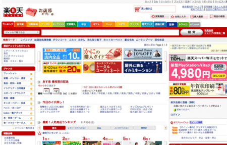
Open your browser and try some famous sites in Japan as : Goo, Rakuten, Yomiuri, NicoNico, OKWave, @cosme,..
Visible in the dense block
Small images with minimal quality
You can not count how many columns
Bright color , contrasting with the banners go in. This
Obsolete technologies – such as Flash .
The site almost minimalist appearance .
The page wabi-sabi as very rare . Many hypotheses have been proposed and I also try to explain what’s popular based on the following .
Differences in language
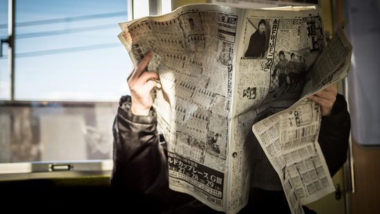
Familiar with character : Signs shorthand – based on language can have a lot of significance on only a few characters . While the character ( hieroglyphic style ) this can cause discomfort and confusion for those familiar with the Latin alphabet , they actually help the Japanese saying much information easily in a short time ( relative like Chinese)
Lack of emphasis – Japanese no italics or uppercase makes things need more latin alphabet display . This makes it difficult to create contrast geometric arrangement makes words such as typography .
Language barriers – Web and programming languages are based on English language or in Europe in general and that is why the materials and lesson plans are in this language . The translation must be able to make new technologies more slowly .
Cultural differences
Avoid Risks – Japanese Culture generally not encouraged the creation of risk or detached from the majority . Once the precedent has been launched on an interface or behavior exists , it will get people to follow , it has always been accepted even though there may be a better solution . Even their fashion also has its own rules .
Consumer Behavior – Human beings require a high level of safety , through the significance of the long description and specifications , before making purchasing behavior – they are not easily affected by the target problem or an eye-catching visual attraction . Principle of ” Less is more ” does not apply here .
Advertising – Rather than being seen as a tool to attract people , the Japanese company is often viewed as the web simply another form of advertising to bring their message prominently as possible .
The site is used to convey maximum information in the minimum space like a handbook than a interactive tool .
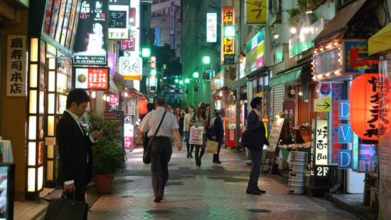
Urban Characteristics – Take a ring around the center of Tokio like Shibuya , you can ” explode eye ” because the ad garish neon everywhere, surrounding the men in business attire or the kids are in school .
But this scene like you ‘re seeing on the Japanese website now . Furthermore , the physical space becomes a luxury in Japan , not to waste space is similar spaces / negative space on this site .
Vacancy – Look at any other employer sites in Japan you will still see ads for these positions as ” web master” and ” web admin ” – like the time it takes a company guy iT alone to maintain their website – this is still in Japan .
The other side of the issue , the creators did not feel the new trend in design is applied in Japan, so they are not interested in working here .
Technical differences
Phone platform – Japan use their technology for mobile web since before the iPhone was born and it’s even more of a personal computer . So is content to fit in a small space and still affected in what we’re seeing .
Web Fonts – The lack of non- latin fonts for the web (Japanese , Chinese, Korean … ) . And each font requires thousands of letters designed to lead to long loading times . For this reason , designers tend to use images instead of text to express the popular typeface .
Windows XP & IE6 – Although the number of users Microsoft is declining rapidly , the number of remains is still big , especially in office environments .
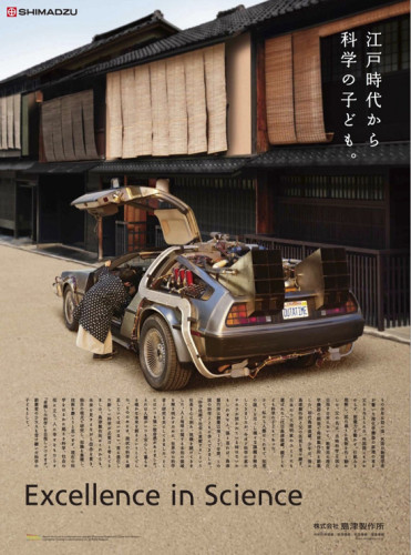
Walking around Tokio , I often recalled images of the 1980s – a conflict with surface design in Japan . Besides the auto giant corporations you still see master craftsmen are making these amazing products and handy .
Another notable positive is the small design studios and companies such as UNIQLO , MUJI , COOKPAD and Kinokuniya are creating full website aesthetics associated with functions in Japan . We hope the rest will soon change similar .
Update 1 : Many people also give examples of sites of China , South Korea , Taiwan .
Mainland China: Sina, 163, 51job, SouFun, Eastday
South Korea: Naver, Daum, Tistory, Nate, Chosun
Taiwan: Eyny, Yam, PChome, HiNet, Ruten
Update 2 : This theme is really more interested in design forums and create interesting debate .


