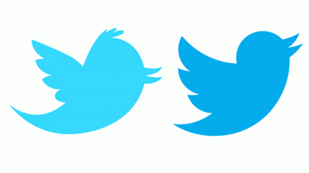
You notice? Twitter took off his icon
Do you think Twitter choose your bird as a symbol because it can sing? Wrong! Twitter said it was “soaring high above the earth and larger eye around, or along with other birds achieve common goals, a bird in flight represents freedom, hope and limitless possibilities “.
What is this flying event? It is based on a new formal design of the Twitter bird, with clear shapes and more meaningful.
Our new bird raised from love, it is designed based on the ring-shaped links and basic geometry. This bird is meticulously designed from the alignment of the circle – the same way you build networks, inspire and connect ideas, to communicate with colleagues friends.
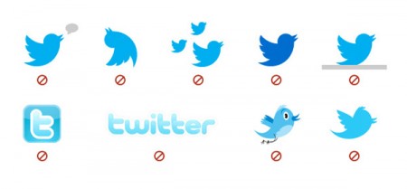
According to this design, the particular you must not:
– Add a talking bird shape.
– Do not overturn it
– Do not add it to my brothers and sisters
– Do not change the color of it
– Do not create a bean tree branches or rocks to it
– Do not use the letter T for Twitter as before, it should be replaced by bird
– No paint it legs or eyes
– Although few people realize but should properly use this new bird.
Behind this change was the goal of “Make bird Twitter and Twitter birds”.
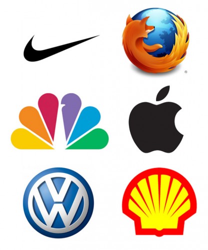
And Twitter are looking to go the way that other successful brands are doing. Just look at the icon and you get the name of the company.


