27 Responsive Web Design Impressive
Web designers in the world at this time are discussed on the Web flexible (responsive website). Even if people do not like it, but this trend will continue over the next few years, along with the development of a wide variety of mobile devices.
To check a site that “flexibility” or not, you can use your mouse to drag the narrow way of the browser page. If the elements rearrange width was narrow, it was designed “flexible”. However, some pages change only when you use the device to access devices.
For those who have doubts about this trend, let’s see the most familiar sites using reponsive How wonderful. (Click on the picture to go to link)
1. BBC
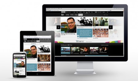
The world’s largest news website BBC chose this trend for your design. This BBC can be read on any device, from phones to tablets of all kinds get more. The minimalist design site presents spectacular images, contents bright.
2. Disney
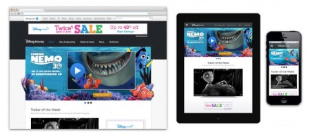
Fanciful family has developed responsive web design with a “small” 30 programmers and website launched in October. Design allows you to obtain the contents of the website and the big picture, and video without losing quality.
3. Zurb
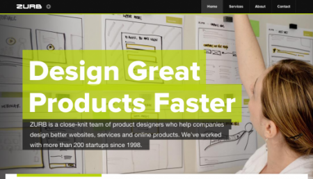
Some companies present flexible web design layouts are optimized, while still meeting the requirements of the business. Most evident studio next Silicon Valley Zurb.
Overall layout has solved a common problem when there is too much space (white space) in the process of moving graphical elements from the desktop to mobile devices. The result is a coherent and complete Hoa layout of any size.
4. Design Week Portland
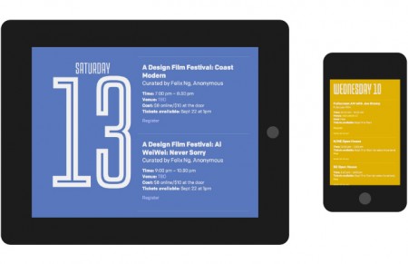
Workshop supported by Scribble Tone text from start to finish, site of Design Week Portland define the meaning of “fulfill”.
The whole the announce page is a course overturn the conventional design trends – including, but not limited to a single site and a custom web typography style – but you do not feel confused.
Young page layout, bring brand organizer and a great design company.
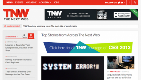
5. The Next Web
How can you talk about the flexible web that do not understand anything about it. The Next Web changed from late 2012 to keep up with this trend – users can read on your phone easily and feel the unity on any device. It is also one of the important reasons of Flexible Web: It looks good everywhere.
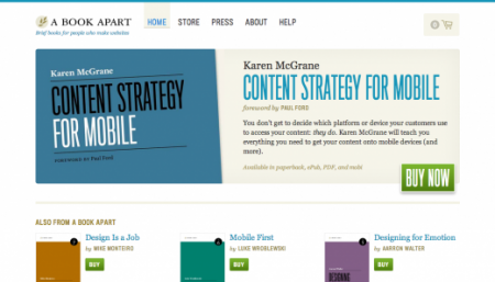
6. A Book Apart
A company that wrote the book on design flexibility. A Book Apart, where bear tracks responsibilities of blogs on the Web A List Apart, is easily the best example of a commercial site selection of the benefits of flexible design.
This needs a management and smart layout elements and not messy. It aesthetically, confirming the brand’s page.
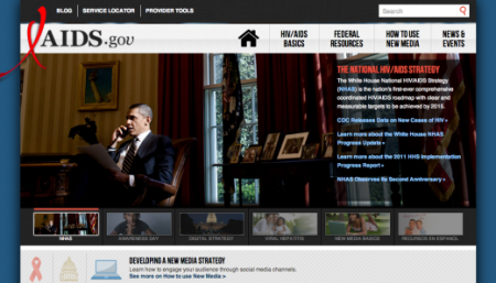
7. AIDS
Even a government website also hopes to design flexible, aids.gov balance between a strong message and a good design. According to those who choose this type of design; “Construction AIDS.gov responsive allows us to focus on all objects, everywhere, with any device they can access.”
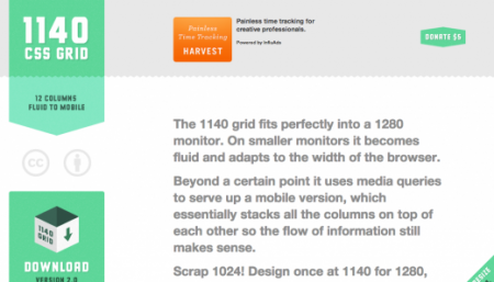
8. CSS Grid
Not surprisingly, one of the best examples of flexible Web is a tool for developers to re-create the same experience.
Css Grid is a free product that allows developers to build web pages with larger size, resolution 1280 px is quickly becoming the new standard – and reduce the reverse is the layout for mobile devices.
9. Tattly
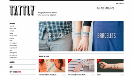
A temporary tattoo? Who knew that a flexible website design can create a strange but beautiful product. Tattly was to take advantage of the flexibility to create a web site to provide temporary tattoos.
10. Harvard University
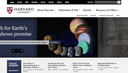
Reponsive design Harvard’s clean and classic, not losing decades of brand building online. The result is an intuitive layout, not too modern. This site is a perfect example of the difference between the layout (layout) and design.
11. Time
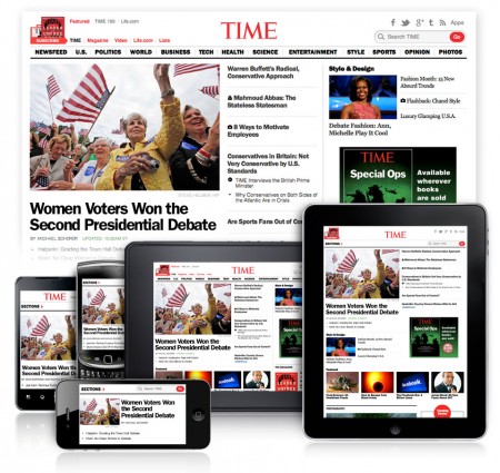
With the decision to change the design on January 10, Time presented their goal is to provide uniform experience to the reader: “Because some devices will yield different results, while setting Mobile will be the means by which users access the first to see it. ”
Time’s minimalist design, easy to read, and of course, the global news site will be consistent across all devices.
12. Boston Globe
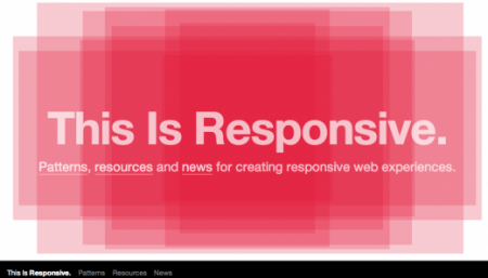
13. This is Responsive
Brainchild of Github. This site is a tool to indicate the size of the flexible Web. Best features of the web is the perfect shape flexible motion in the middle of the page, and, of course, with any customization platform.
Flexible motion is really unique idea, the site promises to create a new wave of the future.
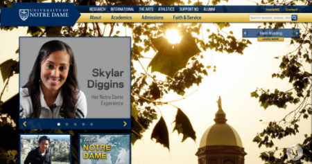
14. Notre Dame
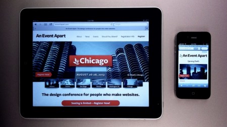
15 An Event Apart
The experts at A List Apart constantly show the strength of their flexible web – They continued to show his ability with An Event Apart.
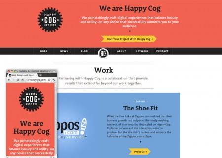
16. Happy Cog
It is clear, sharp and bizarre, design studio Happy Cog to find a best way to present their talents. Company can show a lot of the color and character on the page – and of course it looked perfect in every dimension.
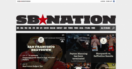
17. SB Nation
18. Spigot
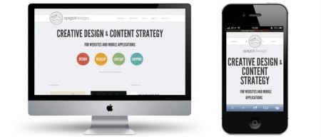
Development and design workshop spigot sell their beautiful design on the home page – it’s hard to describe the feeling great about the design of the page. The best part of the design is a simple sequence of symbols can be horizontal movement.
19. Google Cultural Institute
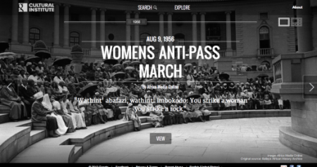
The Google Cultural Institute is one of the few major technology page for that Reponsive is a right choice.
20. Starbucks
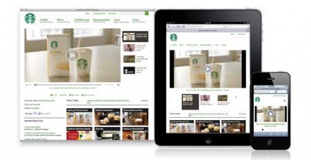
King brand their coffee, Starbucks reason to choose flexible Web is quite simple: to discover and diversification. That more and more companies visit customers in mobile devices, and of course Responsive is the best way to respond to this.
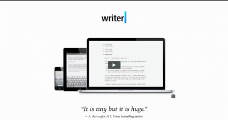
21. iaWriter
22. Illy
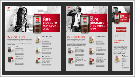
Sleek and smooth like an expensive car, the website of the United States Illy issimo is definitely nice site layout, Sexiest today. It also responds well to an e-commerce website, ensure that the products stand out and be the focus on any device.
23. Sony
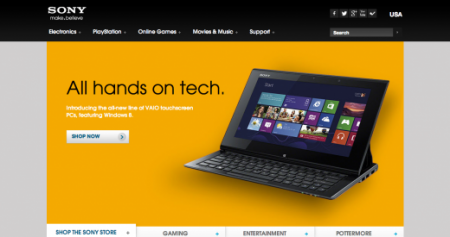
Sony is one of the world’s largest companies joined trend Reponsive in 2012, and it remains a beautiful site to the moment.
Highlights and seamless, there will be more faithful to love the modern design of the Sony, it is also the message that Sony is ready to head in the technology world.
24. dConstruct
25. Grey Goose
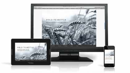
No horizontal bar Bar – Grey Goose beautiful and smooth. A gray palette and style with modern luxury suite layout on any device.
It is probably the best looking tablet, even though many focus on display devices on mobile devices.
26. Microsoft
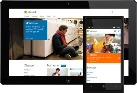
What will happen to the world without Microsoft? Although many people believe that it was on the other side fog steep, but with the recent changes Microsoft is slowly back. Get a minimalist modern design as the leading site for that perfect flexibility with all devices.
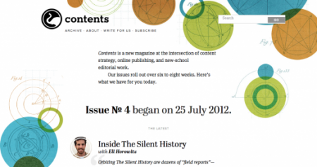
27. Contents Magazine

