200 most memorable moment of the design (p4)
51. Peepshow collective:
Formed in 2000 by a member of the University of Brighton, including Miles Donovan. Peepshow Collective Discover a new way to collaborate by sharing customers, work and ideas.
In addition many gallery exhibitions unique richly illustrated for magazines and newspapers, members create a wide range of image quality for clients and events.
52. Landor for BP
An entirely new flower-shaped logo that Ogilvy and Landor designed for BP in 2001, full of optimism and sustainability. The green fringed with slogan (tagline) “Beyond Petroleum”.
This brand is pioneering the trend of green-friendly environment. Unfortunately after this, on the Gulf of Mexico oil spill that BP image tarnished.
53. Brush for the artist on the iPad
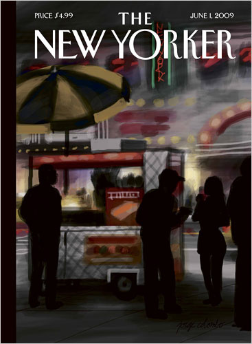
Those who use the iPad merely to read the application will feel wasted with Brushes app. Appear on the iPhone in 2009, Jorge Colombo using it to create a cover for The New Yorker.
Then David Hockney also use the iPad to create the digital files Yorkshire landscape, it’s simply too easy to choose from a variety of colors.
54. Mother won the Naughties
Sly and humorous, Mother’s campaign in 2001 to promote art site good prices (affordable art) briart.com, winning a Black Pencil from Ambient Advertising (interactive ads) A & AD, but was criticized for Posts by the outdoor advertising industry.
Innovative company engaged his posters on the lampposts, railings, signs on the side of the road, all over London, pretending to sell them as works of art.
55. Rising star Jessica Walsh
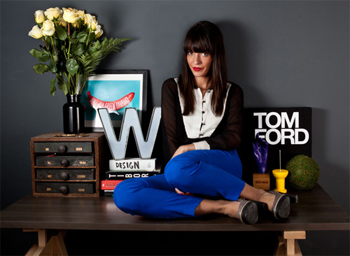
Powerful, colorful and surprising works of Jessica Walsh often have the 3D body parts and objects made by hand crazy and bold arrangements, clearly and directly. In a natural way, after graduation in 2008, she was invited to collaborate with Sagmeister and design 2 sheets cover for Computer Arts.
56. Robots
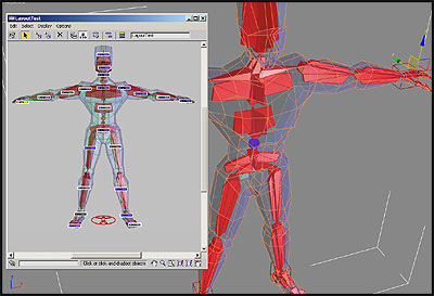
Professional 3D software 3ds Max 4, 2003. Special feature in this version of the character is attached to the motion.
57. I wonder what she will do next?
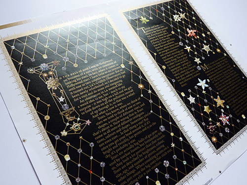
That’s what people ask when blown by Canadian designer Marian Bantjes with products I Wonder 2010. One end of the book excellent exploration of typography, pattern and image with the series mixed by the complex design patterns.
58. Quark killer
When Steve Jobs realize that Adobe is becoming the “killer of Quark” in 1999, announced that it will have one killer software for DTP (desktop publishing software).
Jobs help demonstrate the software with Apple. Quark then realized the danger and tried to acquire Adobe, but what happens – Catch first event 114.
59. Modern style identifier THE TATE
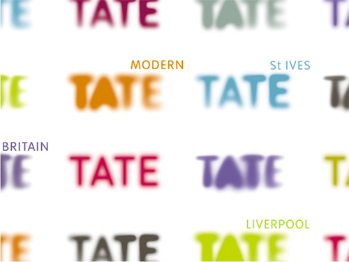
Inspiration for designers and artists everywhere, the Tate Gallery’s newest family home was opened in 2000 in London. Wolff Olins designed the new brand identity for the Gallery with a style faded logo text (out-of-focus).
60. The End of Print
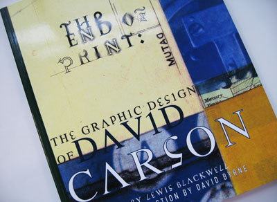
Coming from a world of surfing and word play smudgy (dirty type), David Carson – one of the most influential designers. The End of Print (The end of print) is one of four of his books, the discovery of the text, graphics and images. He also opened his own studio this year.
61 Year new clothes for Creative Suite 3
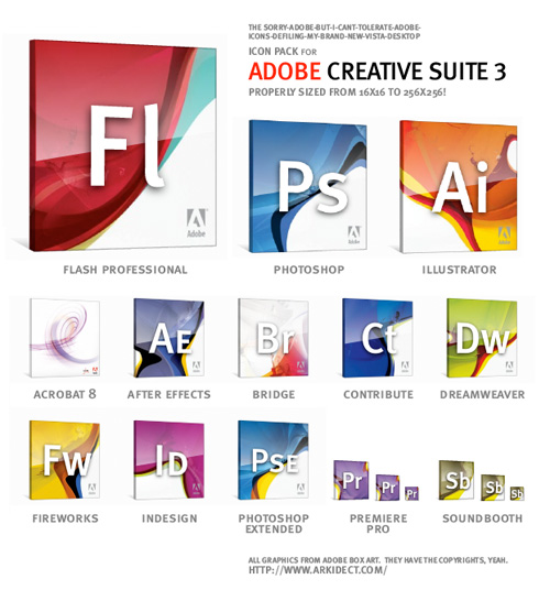
Adobe Creative Suite become more friendly in 2007 when IDEO to use design solutions label use a valve sustainability by the minimalist design and style and little substance. The idea is appreciated.

