
Dropdown Menu Of Website Optimization E-Commerce
Drop menu (drop-down menu, also known as drop-menu) is an effective presentation tool for electronic shopping sites as well as many other websites. Hidden potential, a reasonable drop-designed will be a great companion and full of sympathy for all customers to visit your site.
This article will lead them and analyze a few sample menus, as well as to the practical application of it in some form of common e-commerce site
Importance
Today, we can hardly find any shopping, retail, distribution, or commercial use of drop-menu as a presentation tool.
In terms of features, it is used as a shortcut to go straight to the list as well as sub-categories of the item that you are looking for buyers, as well as an opportunity to promote key products or incentives .
In terms of design, drop-menu is neat box to tidy up ‘battlefield’ indiscriminately any of those items, pricing, advertising, list category … Extremely useful.
However, if the calibration is not reasonable, it may be ‘battlefield’ into another form more chaos …
Usability
The drop-menu consists of many layers pile will most likely disrupt and distract the eye when users accidentally hover outside the coverage area of the menu, annoying having to search each category from the beginning.
To minimize this possibility, avoid nested more than 2 classes for the drop, here is an example of BestBuy.
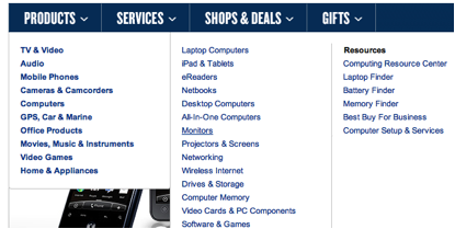
Accordingly, both the main menu and sub-mount, very easy for users accidentally hover outside the coverage area and make the whole disappeared, causing the drop-click process to make from scratch.
At the same time, this type of menu presentation on mobile devices is impossible.
Should also avoid having to scroll in the drop-down menu, which is very cumbersome and like to buy in person, up potentially distract the entire search.
Drop-menu, free drop or right-click?
Another topic to consider is how the menu is activated. In which we have two choices, one is direct the user will have to click the menu is presented (as shown), or just move the cursor to the repositories and automatically drop down menu.
One of the advantages of the measure of one that is whether the user has intentionally or accidentally move the cursor out of the list, they all remain in the same position, from which we solve Repugnant misleading.
However, the many retail distribution page still more preferred 2.
Cause the reason, when customers hover on the list, if the content is not immediately appear, they are very easy to mistake that the content has expired.
Obviously, with shopping sites in general, and e-commere particular, the drop menu is automatically subjects preferred, but exist disadvantages as mentioned above, disappear when the mouse is very the fall out. So how to fix?
In fact, Microsoft’s UK branch homepage overcome disadvantages in a very simple way to adjust the latency is about 1-2s before the menu disappears automatically, just enough time for users to keep mobile mouse back to a reasonable position.
Obviously, this is a simple yet effective solution to the problem of headache many designers as well as annoying to customers so long.
In addition, if a menu bar is easily the best appearance, also easy to play (a convenience rather than disadvantages as above).
Here’s an example, taken from the pages of O2, very fast menu that appears when the cursor is pulled to, but to close, click the X in the corner, so be inconvenient!
Drop-large format menu
This means that the area used to present information and notes in each category increased, more convenient presentation, allowing users to jump directly to specific items they want in the blink of an eye.
Generally convenient and fast. Song, abuse, drop-menus also own damage. Here we analyze two of its advantages-disadvantages:
Pros
Reduce the number of times customers have to click / scroll, easily viewed from beginning to end the entire contents to be shown.
A drop-menu is designed with sophisticated customer with multiple paths to the same product, regardless of whether the query is based on the brand or line type.
Help purify and narrow the search range of customers, minimize the amount of information to be searched and effort spent.
Regulatory support skillful sellers list proposed by the most popular content to customers by placing them in locations visible and make the most attention.
Compatible with the coordinating bar (navigation bar) horizontal, related causes many psychological habit and order of human observers.
Cons
Drop-menu is extremely difficult to operate in a mobile environment. This is a matter of great concern before the state rushing the development of smartphones, tablets … like today.
Drop-Large menu makes it difficult for customers when choosing products like the “being” to provide too much information. Paradox of choice: more choice, more detailed, more complete, more difficult to make decisions.
Compatibility problems with different web browsers. People prefer to use Chrome, Firefox, some IE only know, sometimes code can be compatible with this browser, but having problems with other browsers.
Present not well on large areas can turn a drop-menu width to be a mess, making it difficult for users with accurate information, presentation style “eye damage”. Therefore, colors, images, font design options should be considered carefully.
The typical example of a drop-menu
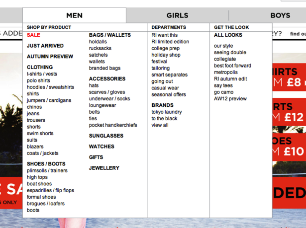
Procurement of M & S application form when changing site design in 2009. A large menu offers all (60 links) lead customers to go shopping every corner of the site.
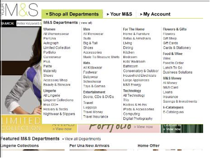
All links will allow you to directly click on and do not need to scroll to see all the contents of the menu; colors, fonts and images do list so bright and easy to see.
Found that the warehouse of nickel present is too large, the current M & S has designed more moderate size menu (shown below).

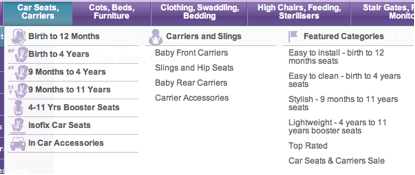
Drop-Kiddicare menu is typical example for effective content filtering, use classification ages to add selected users form more suitable for child seats …
Another example, Argos page nested list of popular products on the top left corner of the menu, effective marketing:
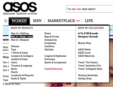
With ASOS, customers do not need a lot of time and effort to fully observe all the categories and sub-categories of products:
‘s Comet also use the drop-large menu, but variations in how they work to present a long list of sub-categories, check the latest deals and most popular products.
River Island in the past using drop-menus “ceiling”, ie you do not have the background for the menu. The list is quite long but looks simple and neat, however, the designer should consider the background of the home page for more difficult to observe.

Currently, the page has been moved to the menu more “traditional” than:
Page Officer’s Club about product pricing arrangement as shown below, this is an example of the screen information to help customers easier to weigh purse. This method is particularly suitable for shopping sites targeting to moderate-income clients.

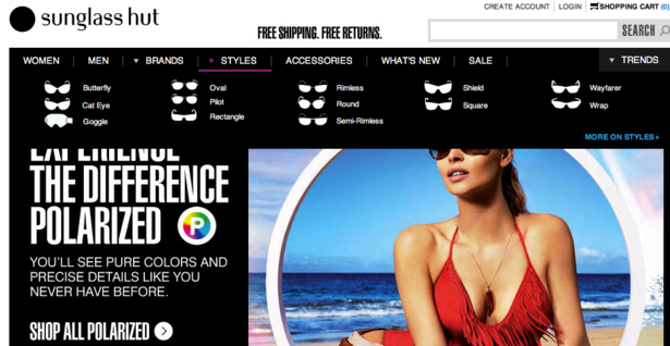
Here is an example worth learning of Sunglass Hut simple page using images of each glass sample eliminates a large amount of unnecessary words to describe the product.
An example from Kiddisave, which is fairly busy, but at least the logo will help customers easier to collate information (back to search).
A few tips on how to upgrade the efficiency drop-menu
Used the title / index
One of the main reasons of the application drop-Large menu is to guide link. To avoid confusion as well as convenient for the customer, the designer and type the appropriate title for the link group similarities.
Share column
Most websites now besides clustering, divide each item into the column with the same criteria as above and separated by a single straight line (dashed sometimes).
Highlight the preferred product
Save time for clients by inserting the store’s best selling product in the drop-menu from which they can go directly to the product without looking for anything else.
High limit
Should pay attention to the height of the menu that you design. On a small screen, most likely it will be beyond the scope of the screen, especially on the theiets such as netbooks, tablets …
Use tools like Google Analytics, you can access device statistics of clients and adjust designs to suit.
Use bold or shadow
Highlight your menu from the other content on the site by the use of shadows or dark side. Should pay attention to this if the color of the menu and the background of the web page does not have much difference.
Compatibility testing
Make sure everything works well on all web browsers.
Consider the width of the menu
Some large format drop-menu is presented clearly, even the most optimistic by extracting the width of the entire width of the site, which helps extend the range presented, and inclusion effects, image and ad … improve efficiency for our customers.
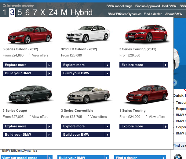
Using multiple images
We easily get brain images than sentences, so be sure to limit the text to a minimum and focus on the maximum visual efficiency, like the example above Sunglass Hut or a site selling cars below:
Advertising sales policy
If your company has sales policies, warranties, or other special instructions …, do not hesitate to release it on their menu.
Based reasonable time
Based standard time occurs, current speed, speed away, if the user does not lag sewing mouse mistaken …
According to Jakob Nielsen, a leading website optimization experts, 0.5 s is appropriate delay before the menu appears, as well as avoid the intercontinental jump menu when the user moves the mouse up.
Tweak menu size if necessary
If a portfolio consists of many different categories, some of them more or less, consider the use of large format menu and divide them by the column.
Some websites combine using multiple columns to divide and limit the height of the lower menu to bring optimum performance.
Attention to detail and the core content
Consider carefully the content you put on the menu, do not further tighten too widespread to just be a mess no purpose, confusing and difficult to understand. Streamlined as possible and eliminate what does not matter.
Bài viết rất hay