
13 User Web Design in 2013
The best way to begin a year as some predict – and as a predictable trend, there are clear and some remains uncertain.
We try to list the 13 design trends that we hope and expect to see them this year.
1. Design flat (Flat design)
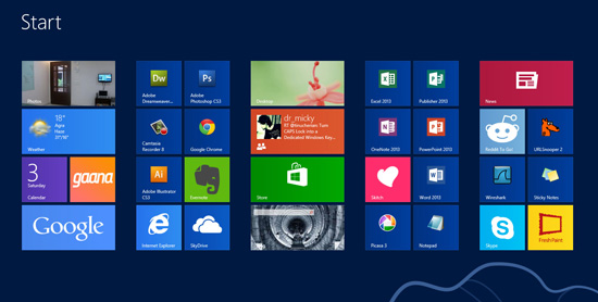
This is a very predictable choice about upcoming trends. Flat design is a design versus style Skeumorphism that Apple has used in the past decade.
Microsoft has done with Windows 8 – also known as Metro style for a few years, so what are you waiting for?
A recent application called Rise to design a good impression with the user by factors completely flat, there is not any thing to create three-dimensional feeling.
2. Less buttons (more touch)
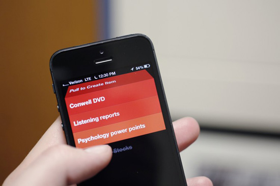
The user experience will become familiar with this. Instead of searching for a node function (eg, copy, or delete), try to point the finger, or other interactions you’ll find things to look for.
Add actions for interactive touch will be the design trend in the next few years, as well as for users to get used to this.
3. Motion (animation), interactive signs (affordance)
Affordance is a term used to refer to an object that, when looking at it you can figure out how to interact it. For example, see in your backpack straps make it to the book, to wear a wire to lock rotation button or zipper …
Tend to make the move as a sign of interaction has been shown in the previous trend forecasting. When you do not have to press the button or icon to select, you can take direction when needed to complete the task are desirable.
There are many applications with very little movement, can be used to direct users to follow the steps to diaphragm the task desired.
4. Type menu “Hamburger”
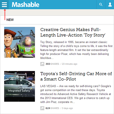
Many applications have used this as an option to the menu, but I think it will become popular. It’s the easiest way to point out that there are many things to choose behind this icon – a few dashes like the piece of hamburger.
An application has to add a little humor, and this. The Magazine of Marco Arment, if you hold this button for about 3 seconds, “hamburger” menu will turn into a real hamburger.
5. Native gripped the Web
See more about Native App and Mobile Web App here.
This is consistent in the last few years, but Native plattform continue to go down and prove (or not demonstrate) the value of it, Native seems to be more frequent choice.
I will not go into details because I do not want to pretend to know all that and less of the native over the web, but can see a lot of applications are developed for a specific platform from the beginning.
6. Flexibility (responsive) without Native
This trend is the perfect contrast to the above, but one thing is all the designer will be observed to choose from throughout the year. When a website launched with the desire to get the audience on a large scale, the an exclusive platform can not be a good choice.
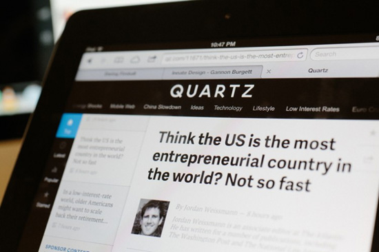
A great example is quartz. Quartz go farther Native, but it is flexible design, we feel that it can run on any device. I can open the page with the iPhone, iPad, Surface Tablet and it works quite similar, for the same information and the same experience.
Reponsive Web – Flexible Web is becoming a popular way for sites specializing in content. If you want to correct design for all devices is impossible and Reponsive is the choice for uniform content.
7. The wider site.
This is a new trend that I see here. Some of the latest blog usually have a narrow width. This helps us to have a good focus, but when you choose to create a flexible web, a site with width 700px leave too much space, for example, when browsing the retina iPad or iMac.
By increasing the horizontal size of the site, it allows the graphical elements prominently displayed as text. A picture is worth a thousand words, so a beautiful picture we see on the website is only about 700 pixels width will be quite a hassle.
8. Larger fonts – and Big Typography
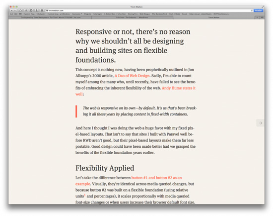
Today, the standard font displayed on the website is from 12 to 14px, but in the future, web developers tend to choose larger font size at 16 to 18px for content. This is an example of Trent Walton.
Along with flexible web (RWD – reponsive web), the text in the Web page presentation plays a very important role, determine the visibility of the presentation.
When font size 18px displayed on the iPhone screen, you will certainly more readable font is 12px. However, except for the large font that is for the long post, it would be very annoying to read on the large screen devices and low resolution.
9. Large search box
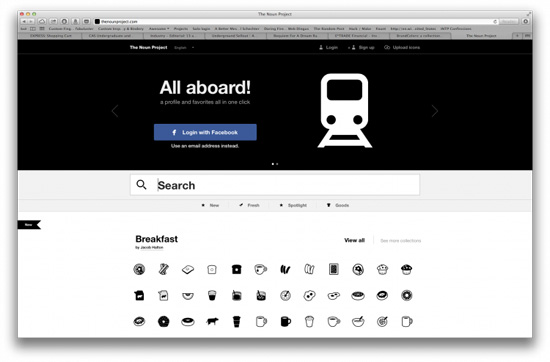
Search is becoming a more important and critical for design. From social networking experience to the publishing industry, the search function is the need to distinguish between what we want / need for what we do not want.
A typical example is The Noun Project and Myspace, both to take advantage of the search good size. Besides Path provides a search with the unique functionality to match their service. It needs more specific search of such models.
10. GIF as a design element
This is a design trend that other writers at The Industry as well as the responses on Twitter will want to include in this article.
GIF is proving an important role in the design. If PNG is the current standard, the GIF will allow the change or movement in a component without having to code a lot.
11. Designed for people
This is not necessarily a trend that is a philosophy.
Marco Arment has done very well this with The Magazine. While the contents of these journals towards technology enthusiasts but Marco Arment said the lack of understanding of technology can still read and understand the contents of each journal.
He does not start with the idea of a beautiful The Magazine, he designed it to become the magazine contains the value, potential, and on a higher connection is philosophy. Like the details of expertise, it is an experience design will have an impact on people.
We do not make products for the design community, we designed with the aim of improving the quality of the world. If you can change the way people interact with devices every day, you will begin to influence their overall labor productivity.
12. The new colors (we are expecting)
Tumblr and Facebook are taking green mainstream If there is a problem prevented the development of the design community, the root cause lies in the color. Up to 60% of the apps on my main screen [original post] is shown with a color: blue (# 00A0D1).
Not only with the icon, the famous site also uses a lot of blue like Tumblr or Pandora, Facebook …
This trend is encouraging web application developers and quit using blue and transferred to a new color. Not all colors are suitable and well as blue, but do not lose anything to try them all.
13. Vector
With the perfect tool in hand, the designers work more easily with vector. Come up with a design idea and develop it for each size, screen resolution has never been a simple task.
Vector would probably be one of the design trends of 2013.
I really love your blog. You write about very interesting things. Thanks for all your tips and information.